
Commonalities of Colors and Color Temperature
Commonality of colours
A color has commonality with its neighbouring colours. The commonality of colours is the basis on which colours are associated. Take blue as the origin, extend three colours on each side, you will find that the further away from the blue, the less blue contained in the colour.
1. Monochrome tone
The combination of dark, medium and light colours of the same colour is a monochrome tone.
2. Proximate colour
Adjacent colours are called near colours, have a strong correlation, can create a sense of harmony, can be in the same tone with a rich texture and level.
3. Complementary colours
The colour of the same straight line of the hue ring is the complementary colour, this match has a strong contrast effect. With fashion, vitality, excitement and other significance.
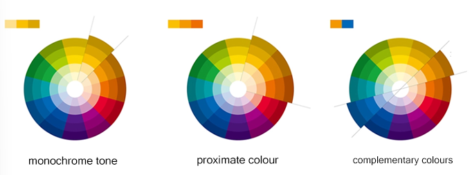
In addition to the above color matching, there are some common contrasting colours, similar colours, medium difference colours, split complementary colours, etc., proficient in colour knowledge, understand the purpose of the demand behind the design, think about the role of colour on the scene performance, emotional communication, so as to be able to better build the colour scheme.
Warmth and coolness of colours
The feeling of warm and cold colours is what people associate with each other over a long period of time. Red, orange and yellow are usually associated with the sun, flame, so it is called warm; blue is associated with blue sky, ice and snow, so it is called cold; green and purple are called neutral colours.
It is important to note that warm and cold colours are relative.
Warm and cold colours produce a variety of relative reactions in the psyche, indicating that the colour has a complexity of expression, and at the same time with the combination of the surrounding environment and other factors, an effect on the human mind.