
19 Common Design Tones and Color Schemes (part 1)
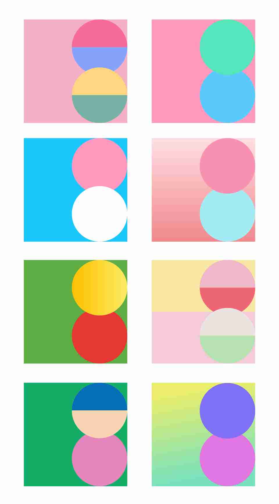
Color plays a significant role in shaping the tone and aesthetics of a design. Choosing the right color combination is essential to achieving the desired tone. Below are some commonly used color schemes:
1. High-End
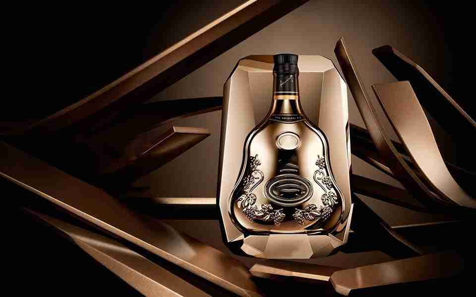
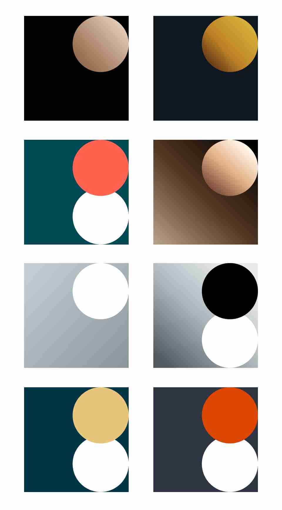
Colors that convey a high-end tone typically have low brightness, low saturation, and limited color variety. Many high-end designs use dark colors as background tones for their understated and mysterious quality, which exudes elegance. These are often paired with auxiliary colors like matte gold, silver, orange-red, or white.
2. Tech

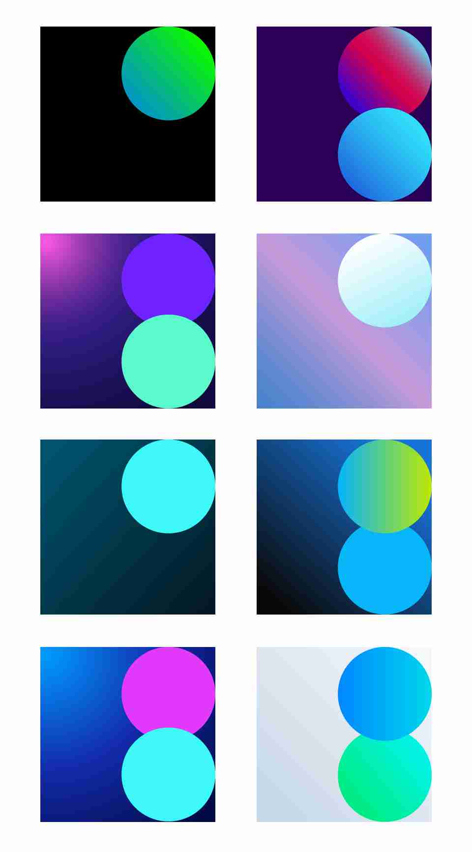
Tech-inspired color schemes often favor cool tones with strong contrasts between light and dark. Gradients are commonly used, such as a deep blue-to-blue gradient for the background, paired with high-saturation, high-brightness cyan and purple as accents. These auxiliary colors create a glowing and vibrant effect.
3. Fashion
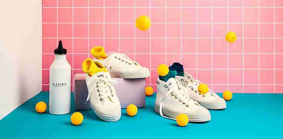
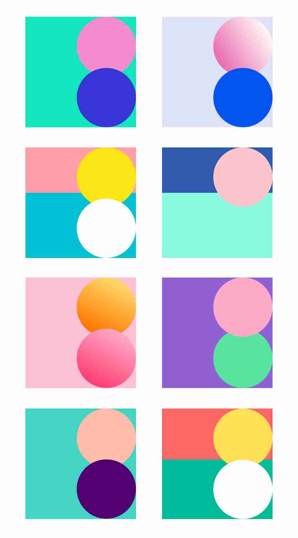
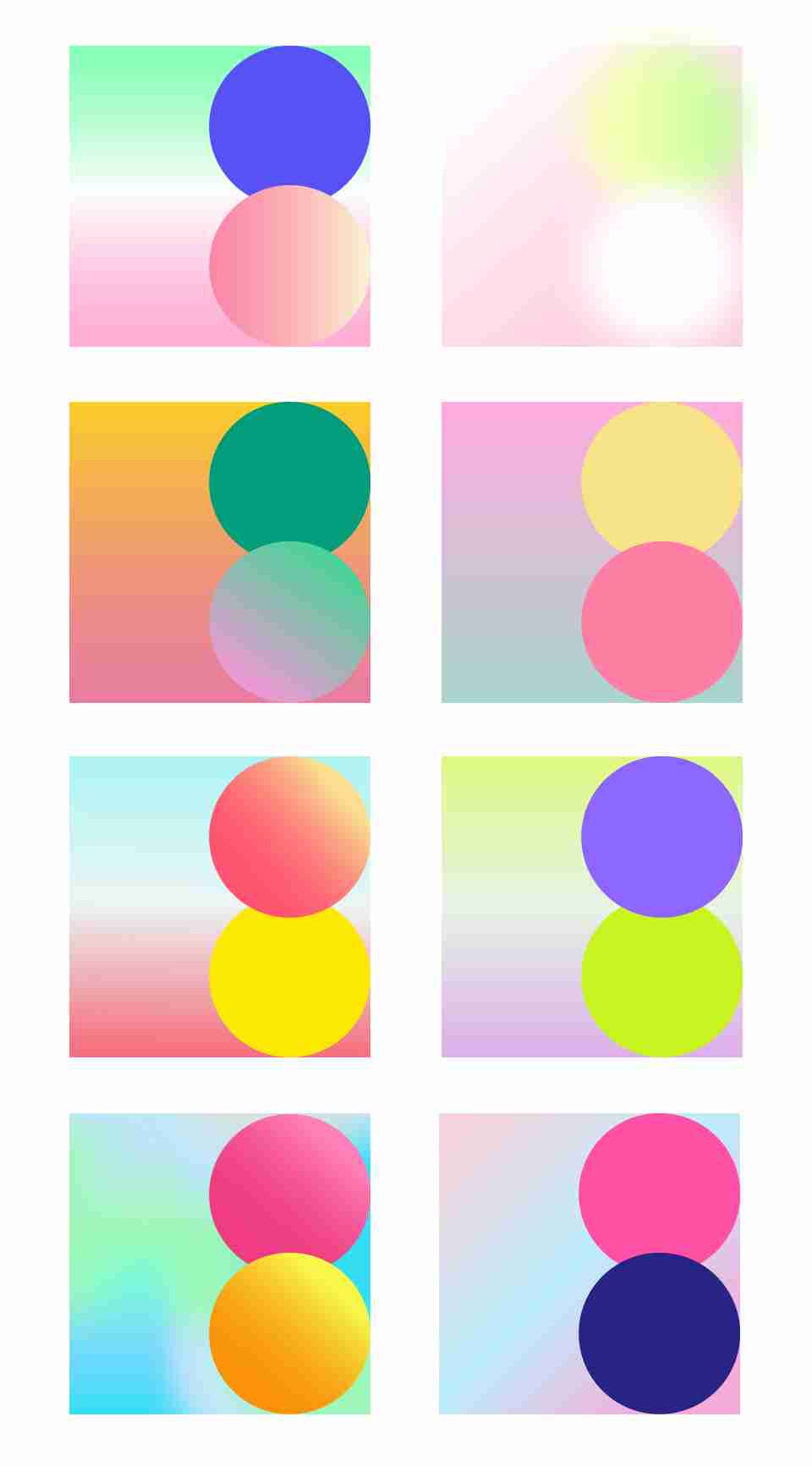
Fashionable colors can suit almost any tone and typically feature high saturation, moderate brightness, and diverse hues. One approach uses solid colors as backgrounds, ideal for branding, web design, and brochures. Another employs gradient backgrounds, which work well for e-commerce and advertising designs.
4. Cool and Edgy

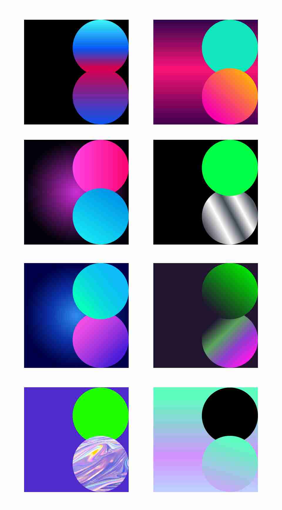
This scheme refers to bold, expressive, and highly individualistic color combinations. These designs often use dark backgrounds with visual elements in high-saturation, high-contrast gradients, resulting in a vibrant and dynamic palette.
5. Appetizing

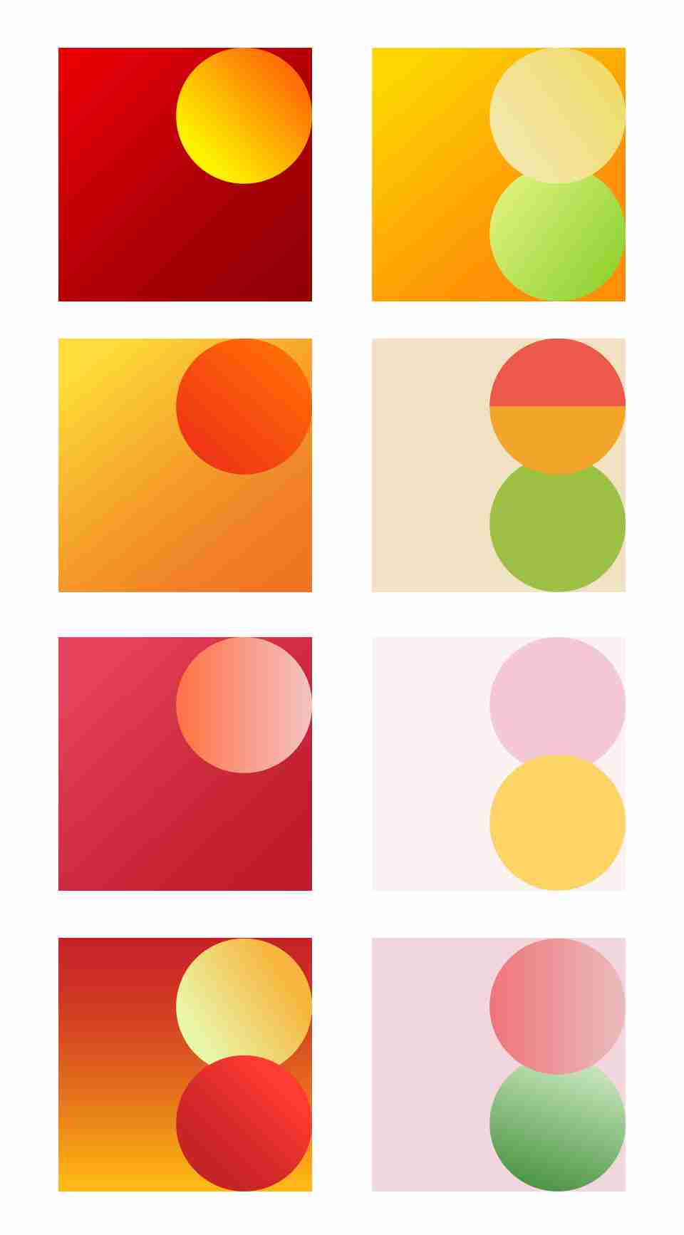
Colors that evoke appetite often revolve around warm tones like red, orange, and yellow. High-saturation, low-brightness schemes are prevalent in the food industry, while low-saturation, high-brightness combinations are more common in dessert and beverage branding.
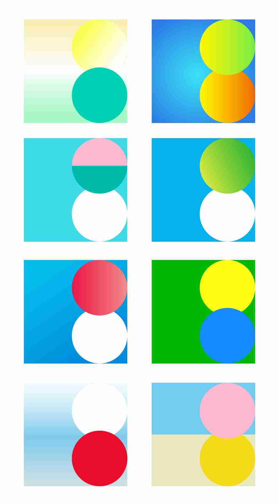
6. Summer

Summer-themed color schemes primarily use cool tones like blue, cyan, and green, complemented by yellow, red, or white. This combination conveys a sense of coolness and joy.
7. Fresh
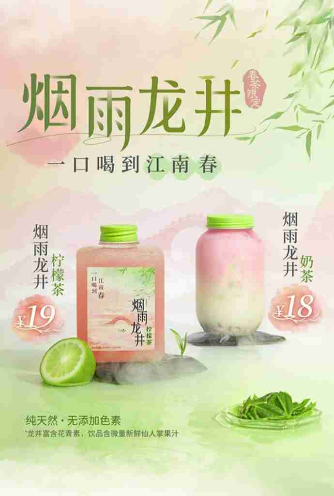
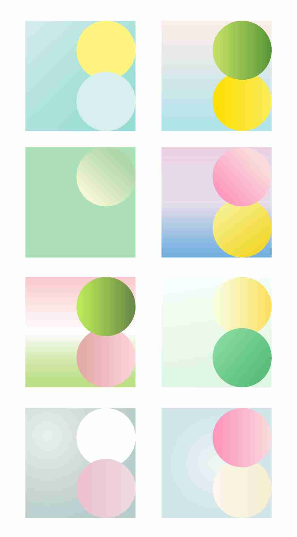
Fresh tones feel light, soft, and elegant. They typically feature high brightness and low saturation. Common colors include light cyan, light green, light yellow, and pink, frequently seen in bubble tea shops and women’s skincare branding.
8. Joyful

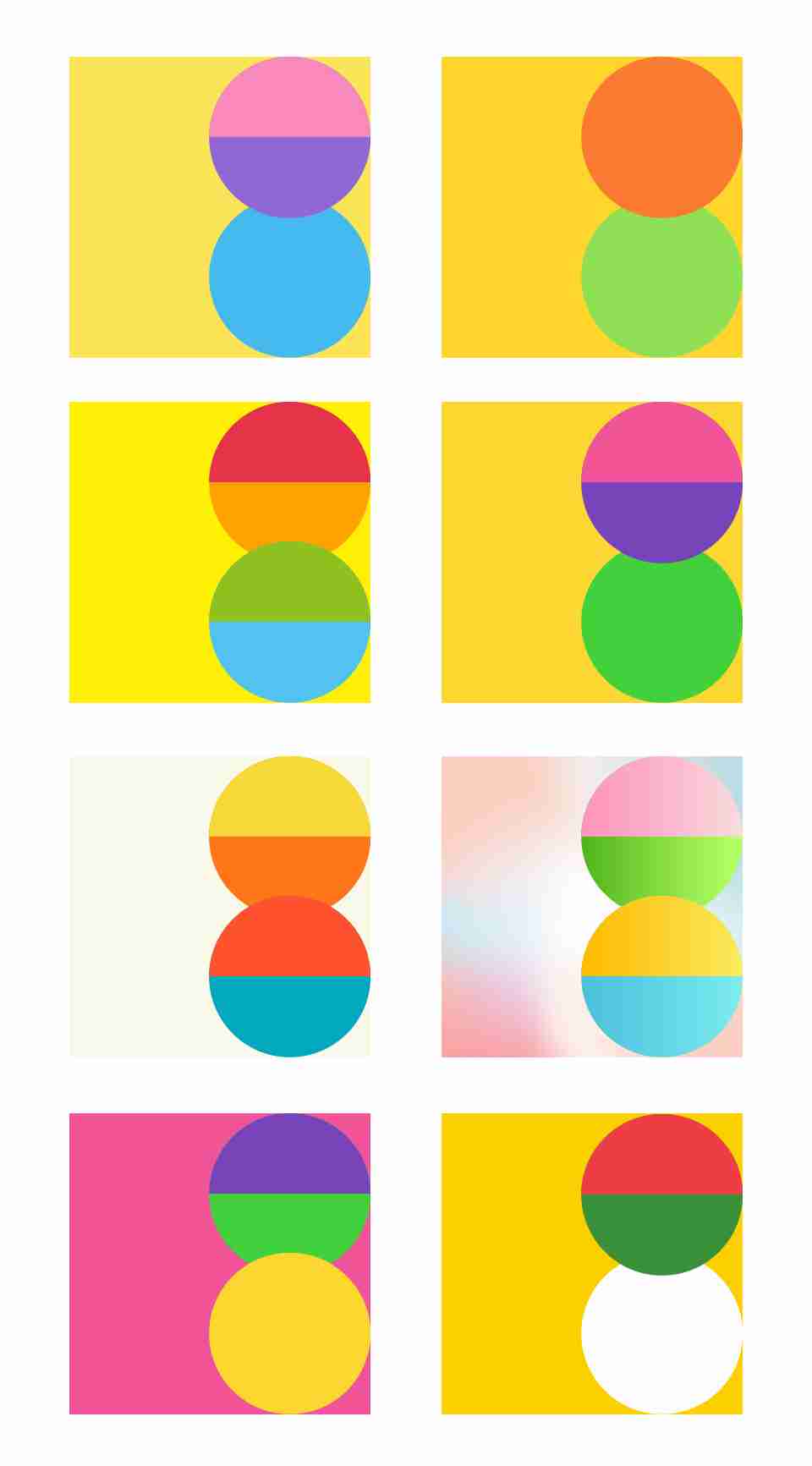
Joyful color schemes are lively and expressive, with high saturation, moderate brightness, and a variety of hues. These often favor warm tones balanced with some cool accents. Yellow is especially symbolic of joy and sunshine, making it a staple choice.
9. Cute
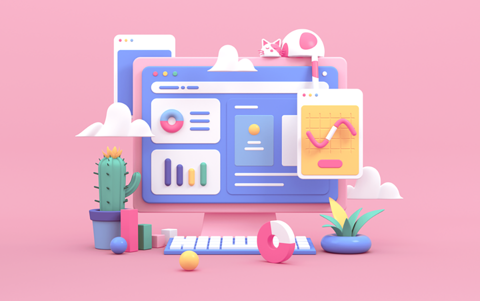
Cute color schemes mix warm and cool colors, with moderate brightness and slightly reduced saturation to create a softer, more appealing effect.
10. Healthy

Common colors for healthy designs include blue, green, cyan, yellow, and white, with red occasionally used as an accent. Healthy tones aim to convey comfort and relaxation, so brightness levels are kept moderate to high.
