
Basic Color Theory – The Three Attributes of Color
The three attributes of color: hue, lightness, and saturation. These three attributes together determine the visual effect of a color.
Hue
Hue refers to the name of various colors, such as red, green, blue, cyan, pink, and yellow. The mixing of these colors can generate a series of other colors, like orange-yellow, blue-green, yellow-green, cyan-purple, red-purple, etc. Developing the ability to recognize color distinctions is key to accurately identifying and expressing color.
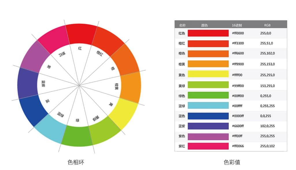
The Concept of the Color Wheel
The color wheel consists of 12 basic colors, divided into three primary colors (red, yellow, blue), three secondary colors (formed by mixing two primary colors), and three tertiary colors (formed by mixing two secondary colors).
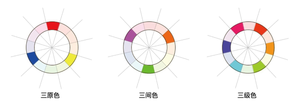
The primary colors are the foundational colors of the color wheel, which cannot be created by mixing any other colors.
Lightness (Value)
Lightness refers to the brightness or darkness of a color, indicating how light or dark it is. It involves two aspects:
The comparative lightness or darkness of pure colors. Among the seven pure spectral colors (red, orange, yellow, green, cyan, blue, and purple), yellow has the highest lightness, appearing the brightest. Orange and green are next, followed by red and cyan, with purple having the lowest lightness, appearing the darkest.
The change in lightness when a color is exposed to varying intensities of light. When a color is illuminated by strong light, it appears lighter, and its lightness increases. When it is in shadow or low light, it appears darker, and its lightness decreases.
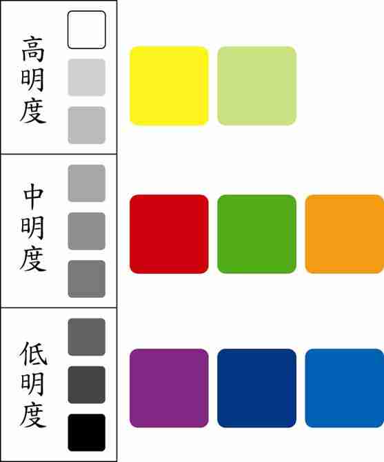
When white is added to a color, its lightness increases; when black is added, its lightness decreases. For example, light red, pale red, bright red, dark red, and deep red are variations of red with different lightness values. The lightness range is from -100 to 100.

Saturation
Saturation refers to the purity or intensity of a color. It indicates the proportion of pure color present in the mix. When a color is mixed with other colors, its saturation decreases.
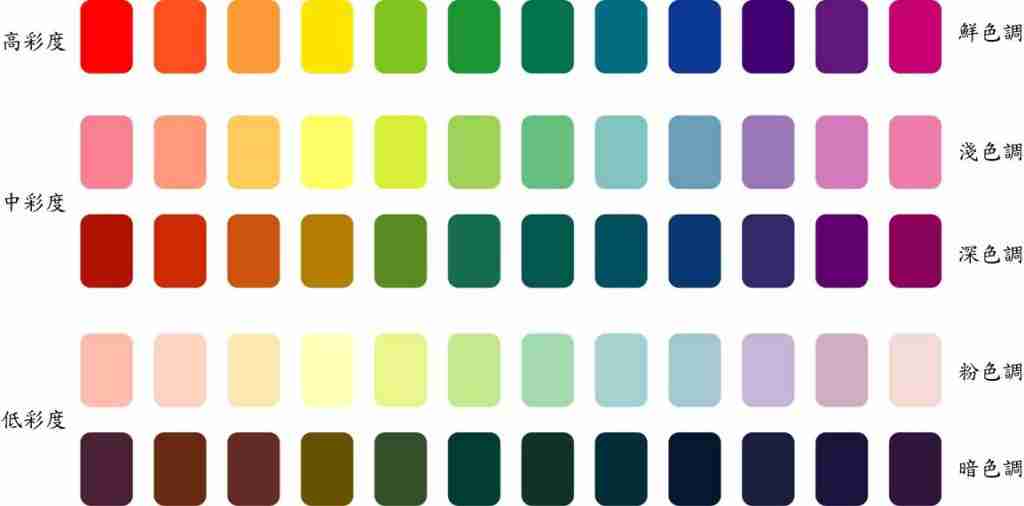
The higher the saturation, the more vivid and intense the color appears. For instance, when red and green are placed together, they create a contrasting effect, but the contrast is most pronounced when both colors are fully saturated. If the saturation of red or green decreases (e.g., red turning to light red or dark red, green turning to light green or dark green), their contrast weakens, and the colors appear more harmonious.
Saturation and lightness should not be confused. A color with high lightness does not necessarily have high saturation. For example, light yellow has high lightness but lower saturation than pure yellow. Similarly, when a color darkens (lightness decreases), its saturation does not necessarily increase. For instance, adding black to red to create dark red lowers its saturation.
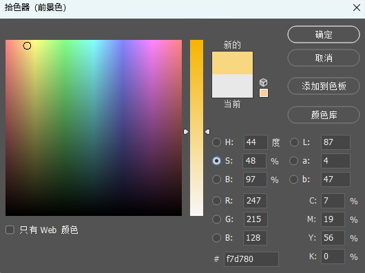
In the Photoshop color picker, selecting S (Saturation) shows a vertical bar representing saturation (from 0% to 100%).
Brightness
Brightness is often confused with lightness, but they refer to different concepts. Brightness refers to the perceived intensity of light, which is related to how light is emitted or reflected by an object.
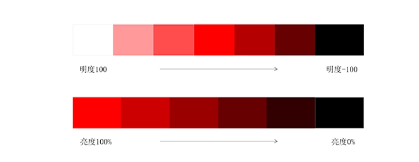
Unlike lightness, which is adjusted by adding white or black to a color, brightness refers to the actual intensity of light affecting the color.
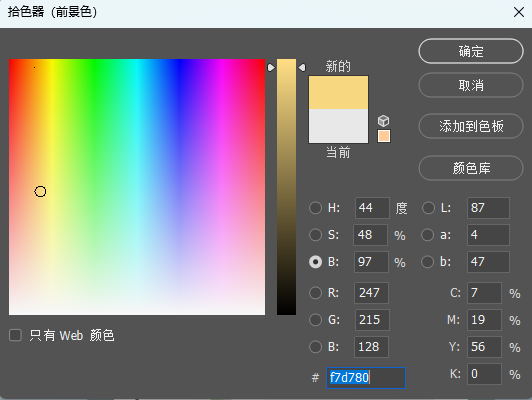
In the Photoshop color picker, selecting B (Brightness) shows a vertical bar representing brightness (from 0% to 100%).