
How to Resolve Color Discrepancy in Printing (part 2)
Color discrepancies in printing are unavoidable, especially given the inherent conflict between CMYK and RGB color modes. Switching to the CMYK color mode during design can mitigate this issue, but some colors are still more prone to discrepancies in printing.
Designers often ask, “I already used the CMYK color mode—why is there still a color difference when printed?”
Don’t worry; this is unavoidable. Too many factors influence printing colors, such as the type of ink (e.g., eco-friendly ink, UV ink, quick-drying ink, etc.), ink manufacturers, ink materials, printing machines, ambient temperature, and humidity.
You may have heard explanations about acceptable discrepancies: a standard color discrepancy of ±10% is considered acceptable for printed materials. But how noticeable is a ±10% discrepancy? Let’s make a comparison:
When using a single primary color without any screening, the discrepancy is relatively acceptable. As shown below, the difference is not very apparent.

However, when two primary colors are mixed, the discrepancy becomes more noticeable. Take a look:
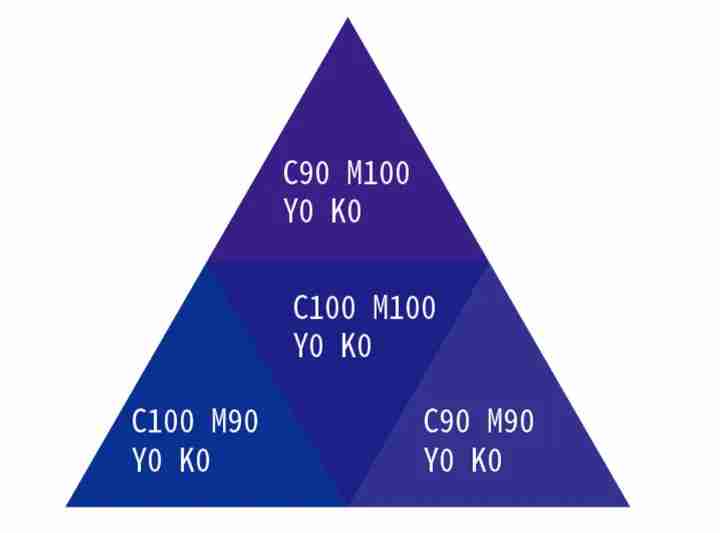

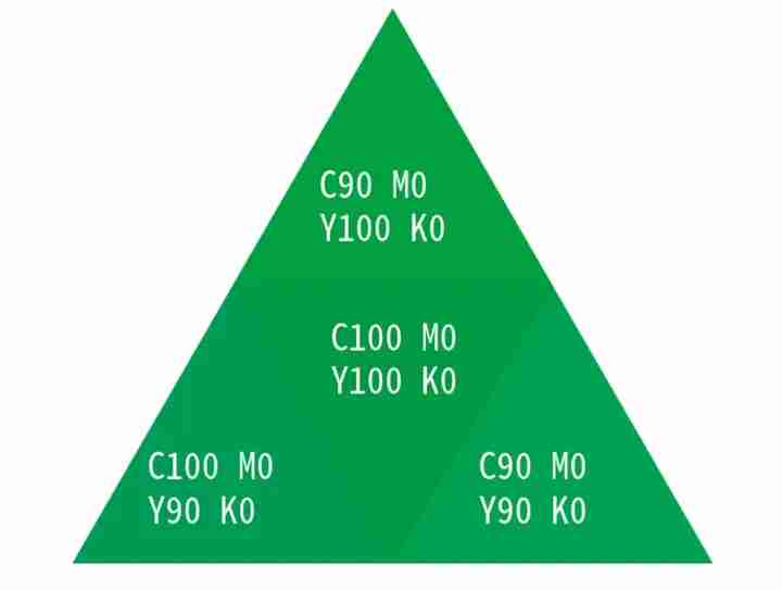
Deep blue has the largest color variation. If the magenta ink (M) decreases slightly, the color appears cooler. If the cyan ink (C) decreases slightly, the color appears warmer. This is the hardest to manage, as every type and brand of ink exhibits varying degrees of color deviation.
For CMYK, “cyan (C)” has a slight magenta tint and leans toward blue, “magenta (M)” contains both cyan and yellow, creating a purplish hue, and “yellow (Y)” has a slight magenta tint, leaning slightly toward orange. As a result, printing a deep blue color that matches your computer screen is quite challenging.
Colors That Give Printing Companies a Headache
Some colors are particularly tricky for printing companies to handle:
Purple

Dark purple
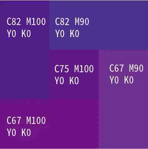
Light purple

Brown
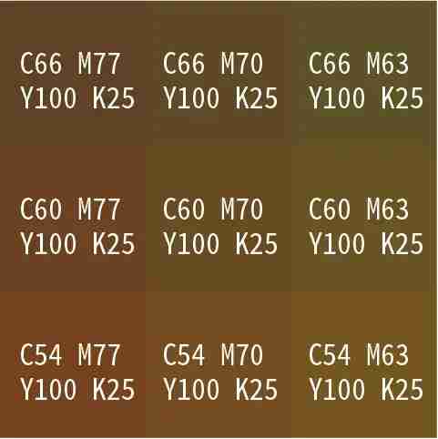
Gray (4-color gray)
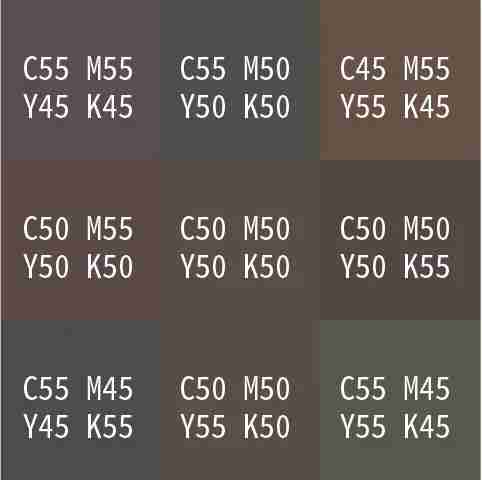
Among these, gray is the most problematic. The potential for noticeable color shifts is vast because even the slightest change in the CMYK ink ratio can cause a significant deviation.
Understanding Spot Colors
Since discrepancies are inevitable, you should familiarize yourself with spot colors. Think of spot colors as “colors specifically customized for a particular print job.” Unlike CMYK, spot colors are not synthesized using four inks but are instead printed using specially mixed inks.
Key Takeaways
- Avoid using colors prone to noticeable deviations, especially 4-color gray. Remove it from your color palette if possible!
- Colors like purple, brown, deep blue, orange, and gradient reds, which are prone to discrepancies, should not be used for large areas of background.
- If you must use the colors mentioned above as a background, and the client has high color accuracy requirements, consider spot color printing.
Important Note: Using spot colors increases printing costs. Moreover, if you use one spot color alongside other CMYK colors, a 5-color printer is required. Two spot colors require a 6-color printer. While 5-color and 6-color printers are common, 7-color and 8-color printers are less available and more expensive.