
19 Common Design Tones and Color Schemes (part 2)
Color plays a significant role in shaping the tone and aesthetics of a design. Choosing the right color combination is essential to achieving the desired tone. Below are some commonly used color schemes:
11. Sporty
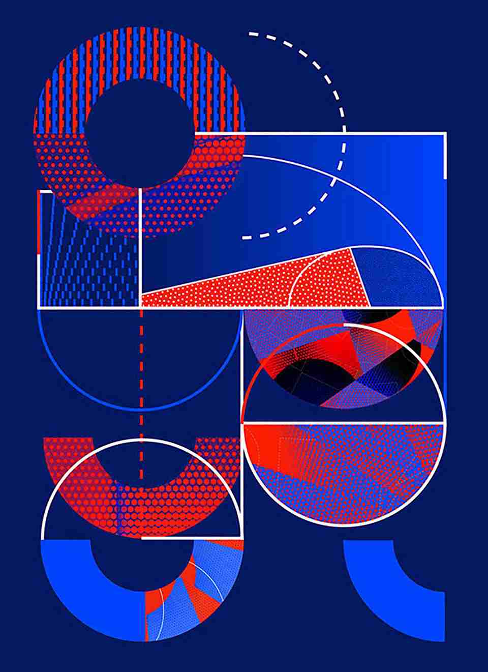
To convey movement and energy, strong contrasts are essential. These can include contrasts in hue, brightness, or saturation. Orange and yellow are vibrant colors often associated with motion, making them common choices in sports-themed designs.
12. Sci-Fi
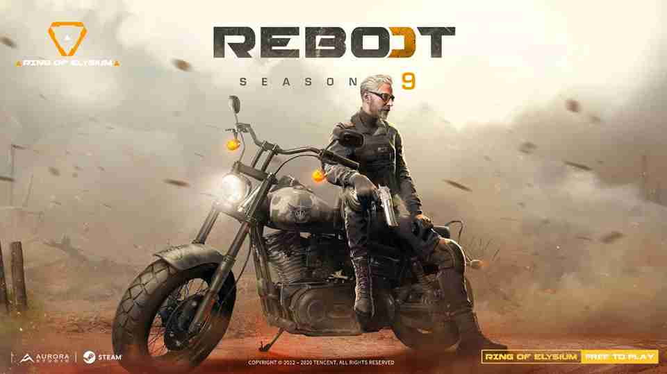
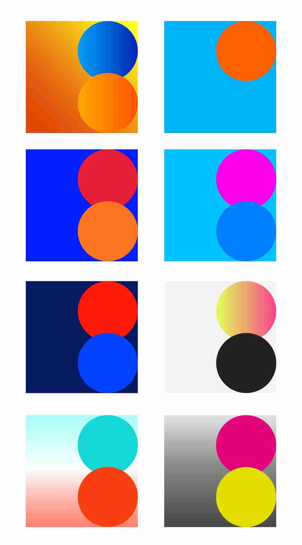
Sci-fi-themed designs, like posters for science fiction movies or mech-themed games, often combine a sense of stability and grandeur. They exude both a futuristic and mysterious vibe, typically featuring darker background colors accented with bright hues like cyan and yellow for highlights.
13. Festive
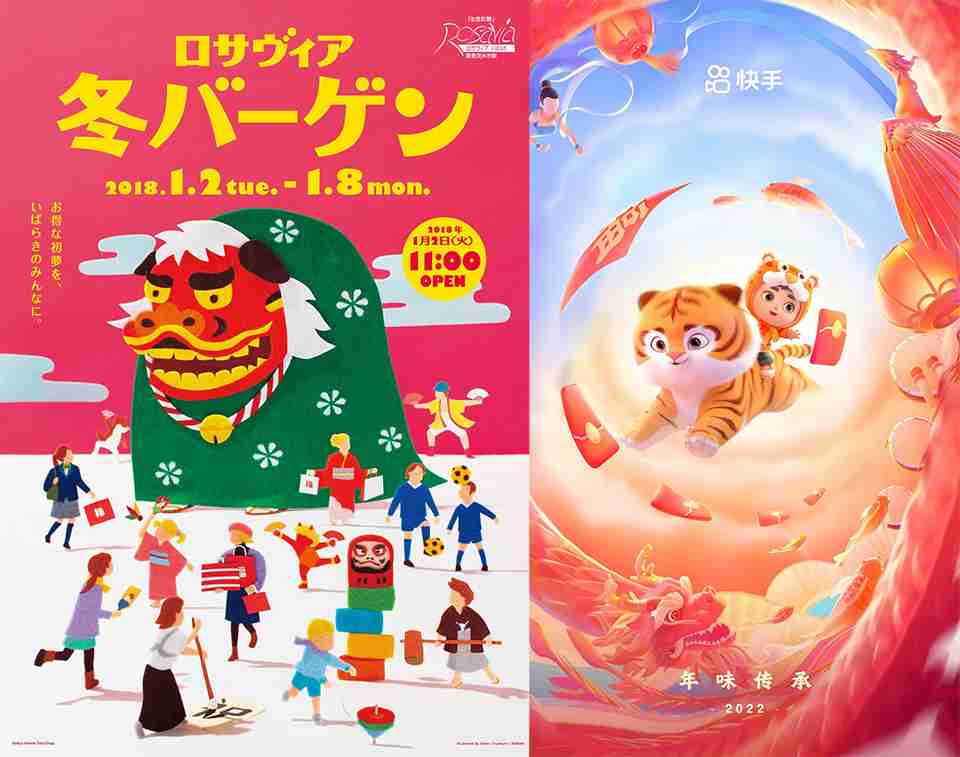
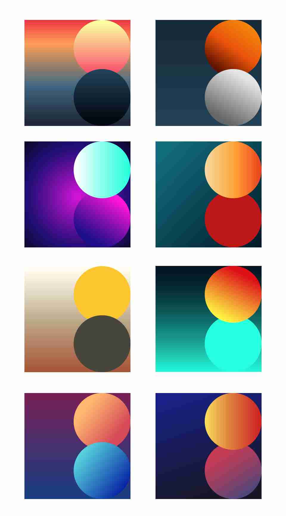
For holiday or promotional posters, festive tones are often used. Combining warm colors with cool tones can create a celebratory atmosphere. Avoid excessively high saturation and brightness to maintain balance.
14. Vintage
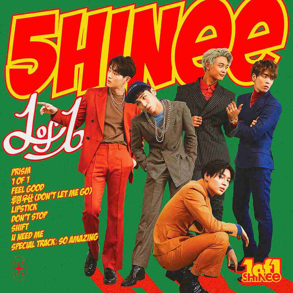
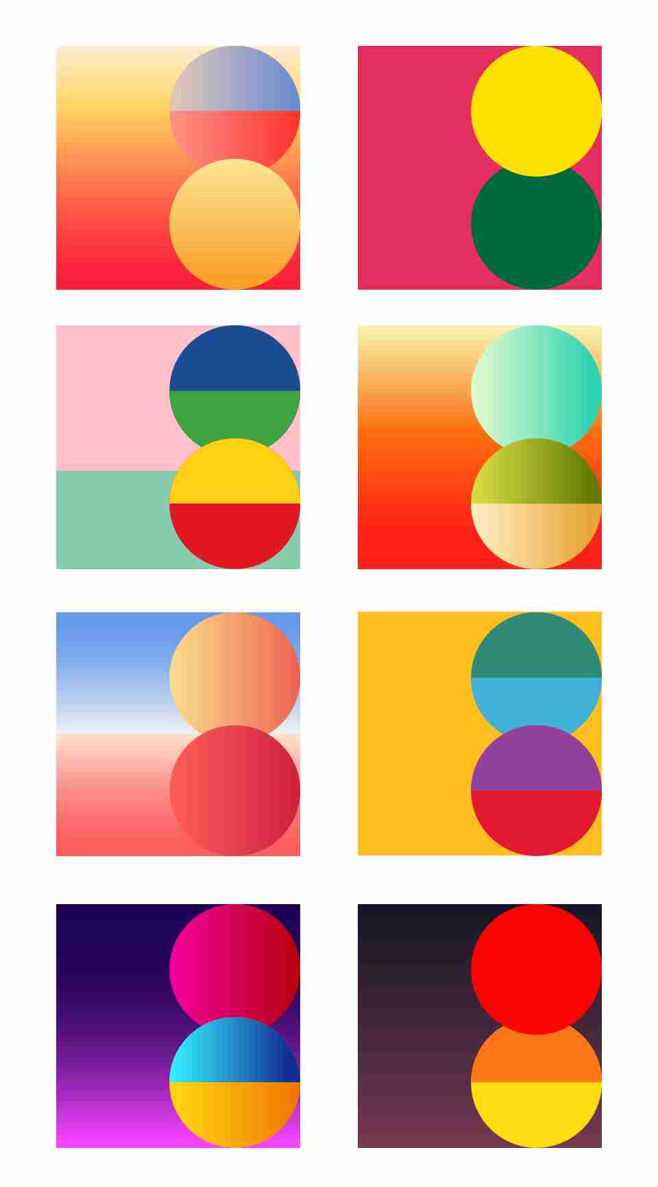
Vintage color schemes tend to feature lower saturation and moderate brightness. These palettes often rely on analogous or complementary color combinations to evoke a nostalgic feel.
15. Chinese Style
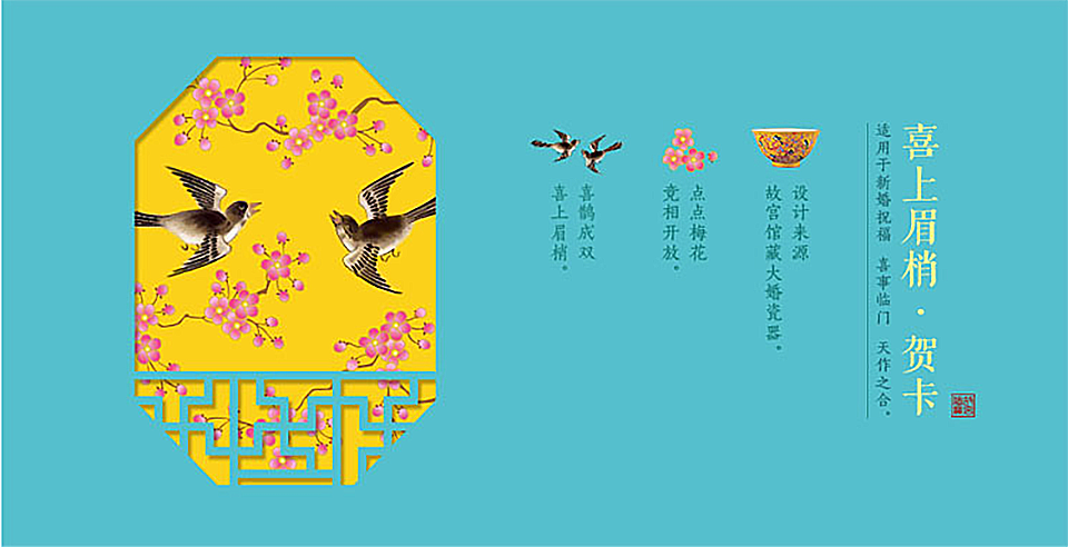
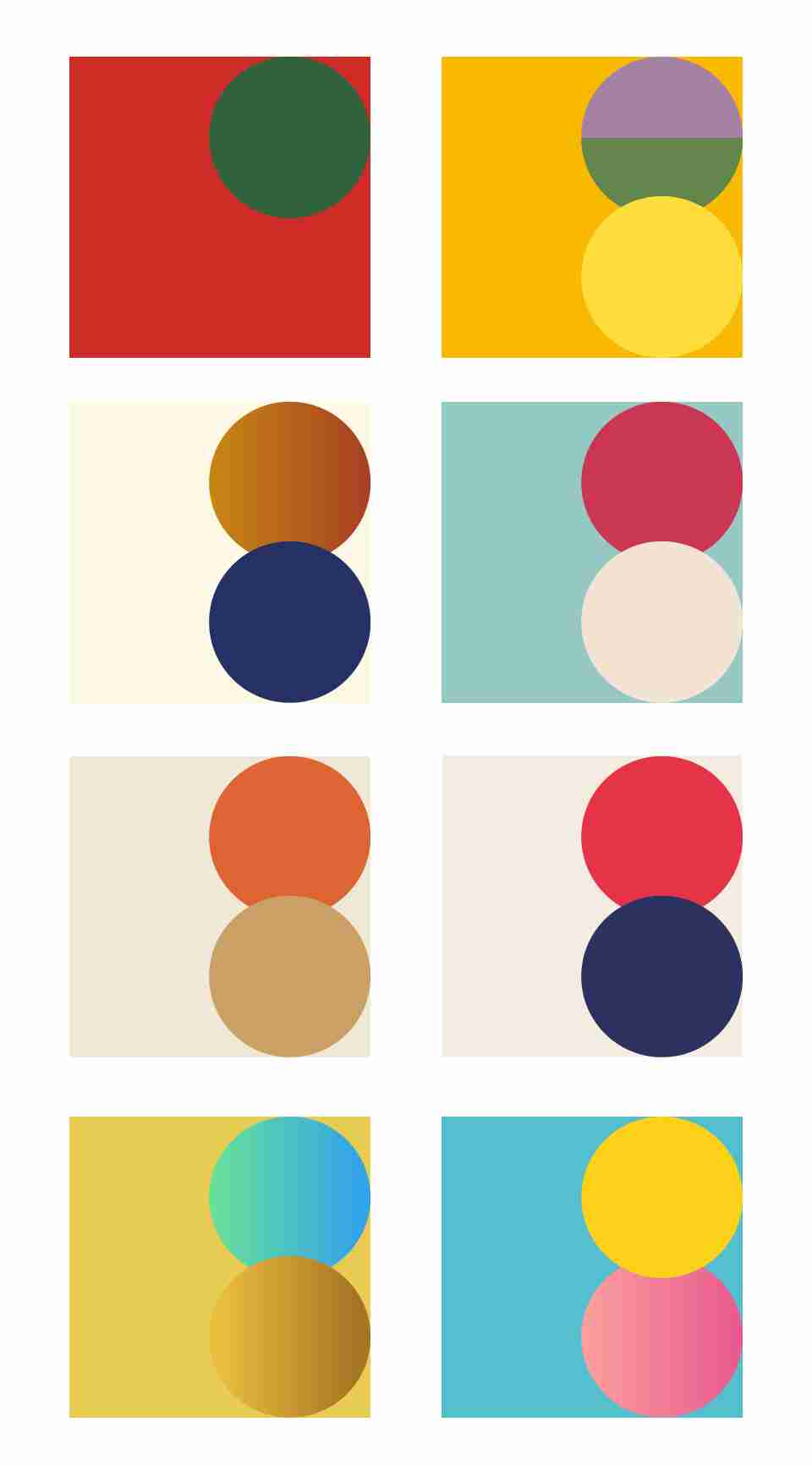
Traditional Chinese-style colors and palettes often feature low-saturation hues that are rich in cultural heritage. Common colors include dark red, medium yellow, deep blue, and brownish hues. These combinations are evocative of a retro and elegant aesthetic.
16. Dreamy
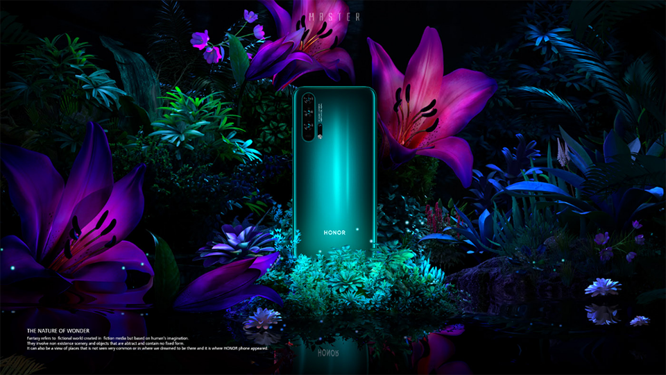
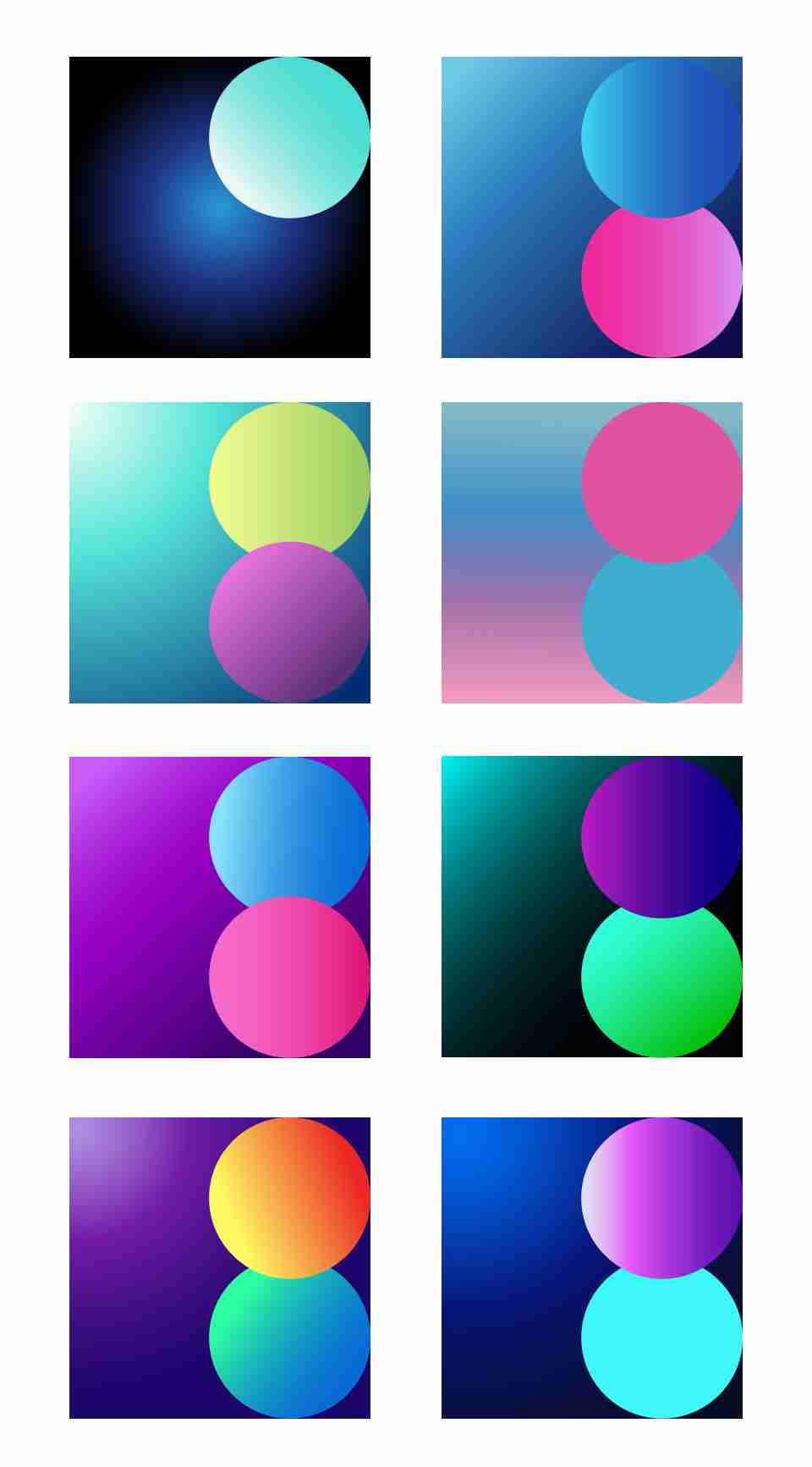
Dreamy tones evoke a sense of wonder and mystery, like finding a glimmer of hope in darkness. Backgrounds often use gradients transitioning from dark to bright colors. These schemes tend to be colorful and rely heavily on gradient effects.
17. Feminine
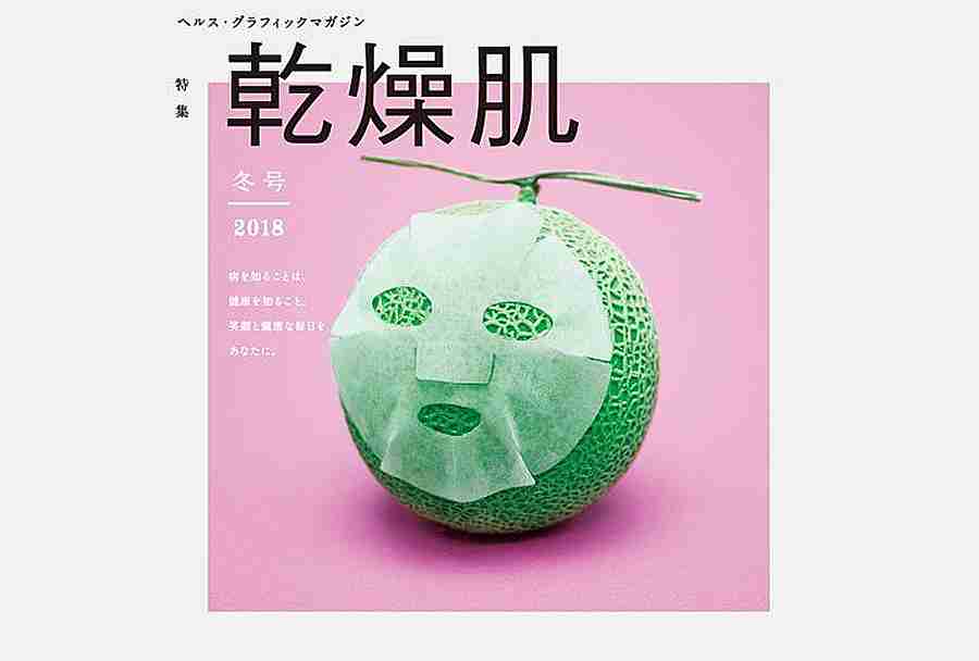
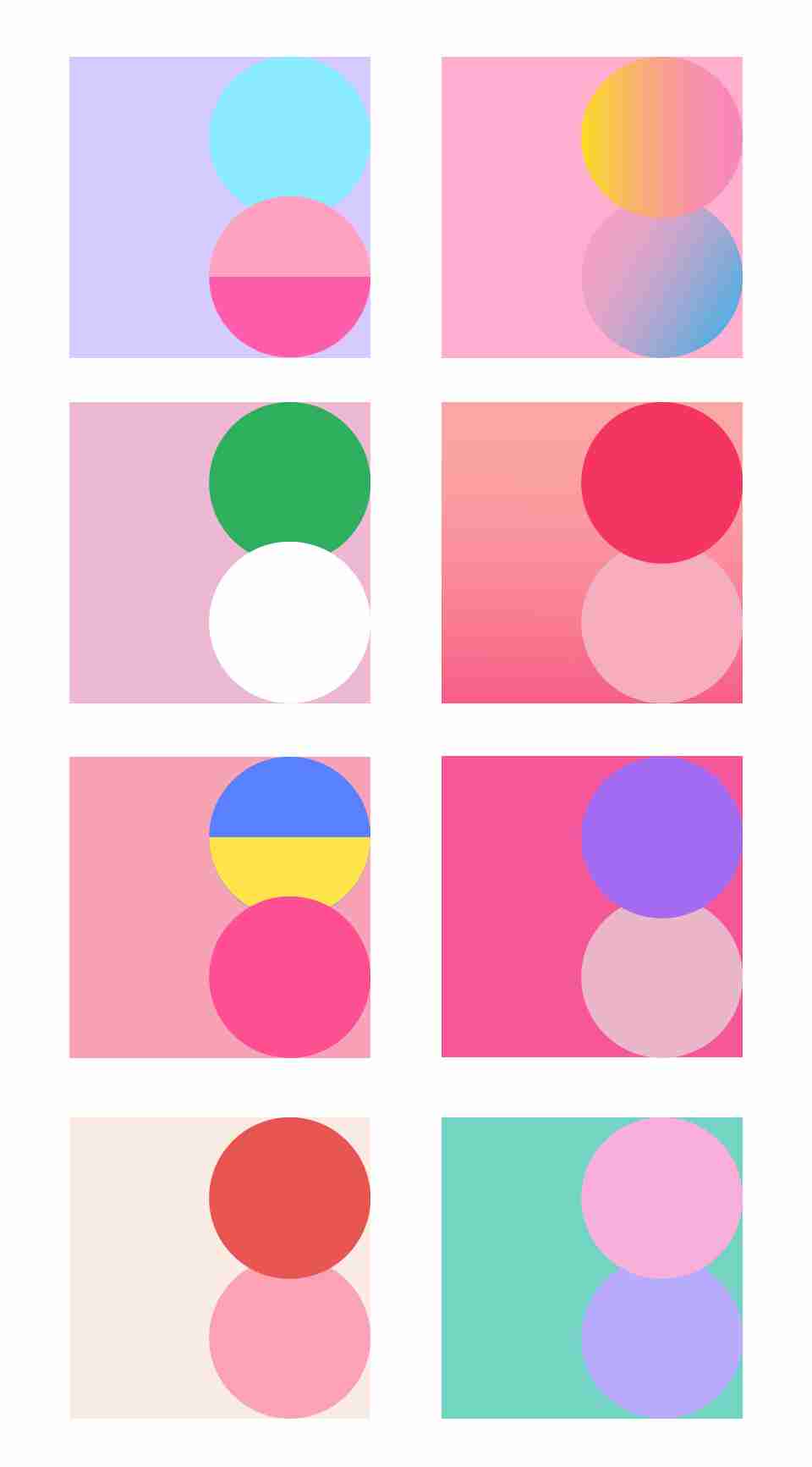
Feminine tones are soft and emotional. These color combinations often use analogous colors, occasionally adding contrasting hues for liveliness. The brightness and saturation levels are moderate, with colors like pink and purple frequently featured.
18. Elegant
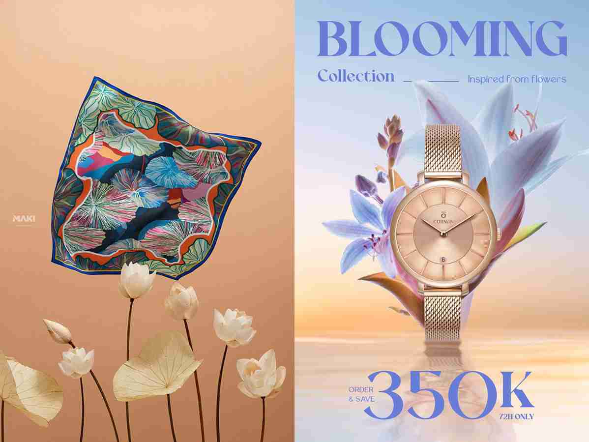
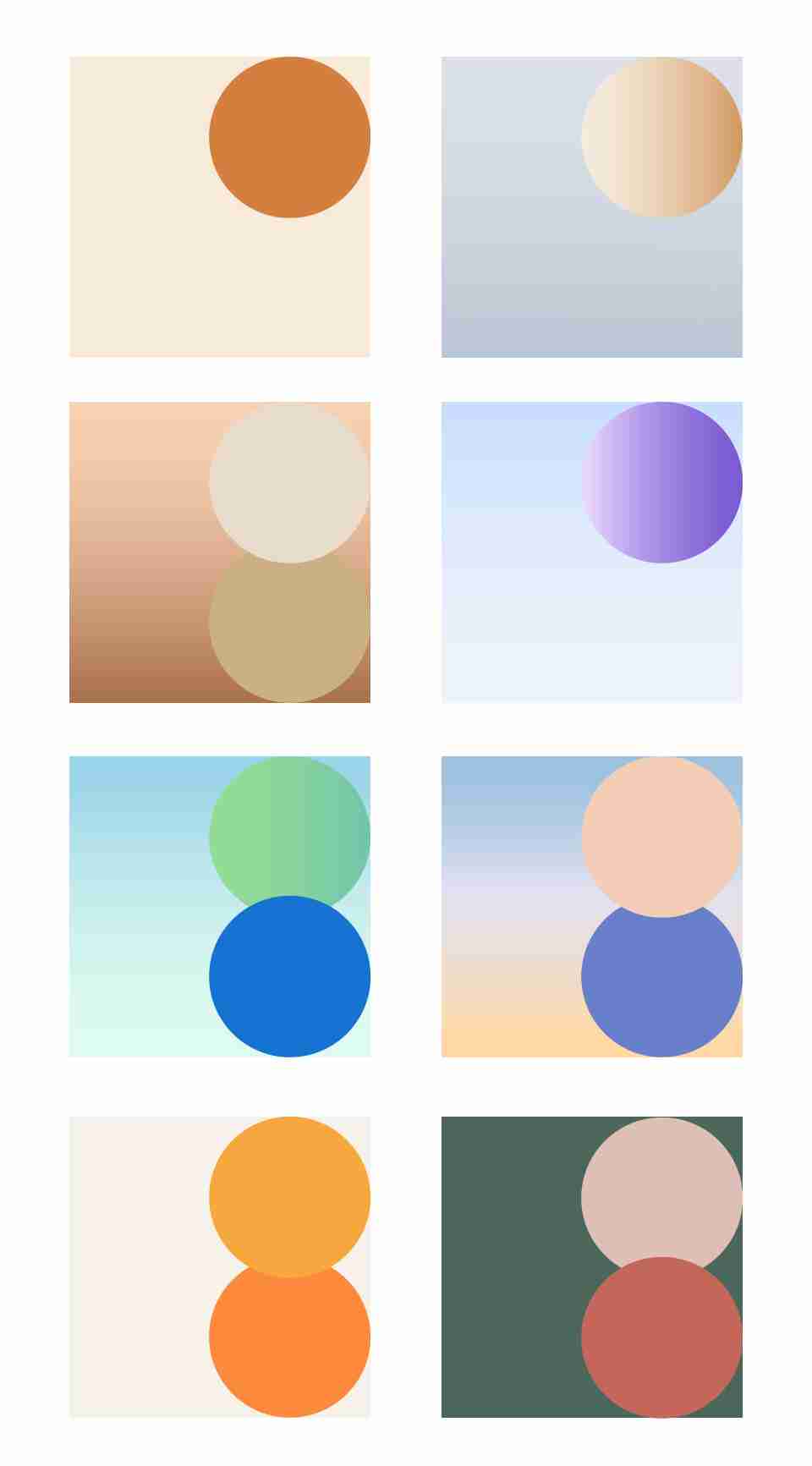
Elegance is associated with subtlety, sophistication, warmth, and calmness. These palettes feature muted tones with minimal contrast, often leaning toward neutral shades. Common colors include khaki, beige, monochromatic schemes, and analogous combinations.
19. Classic Color Combinations
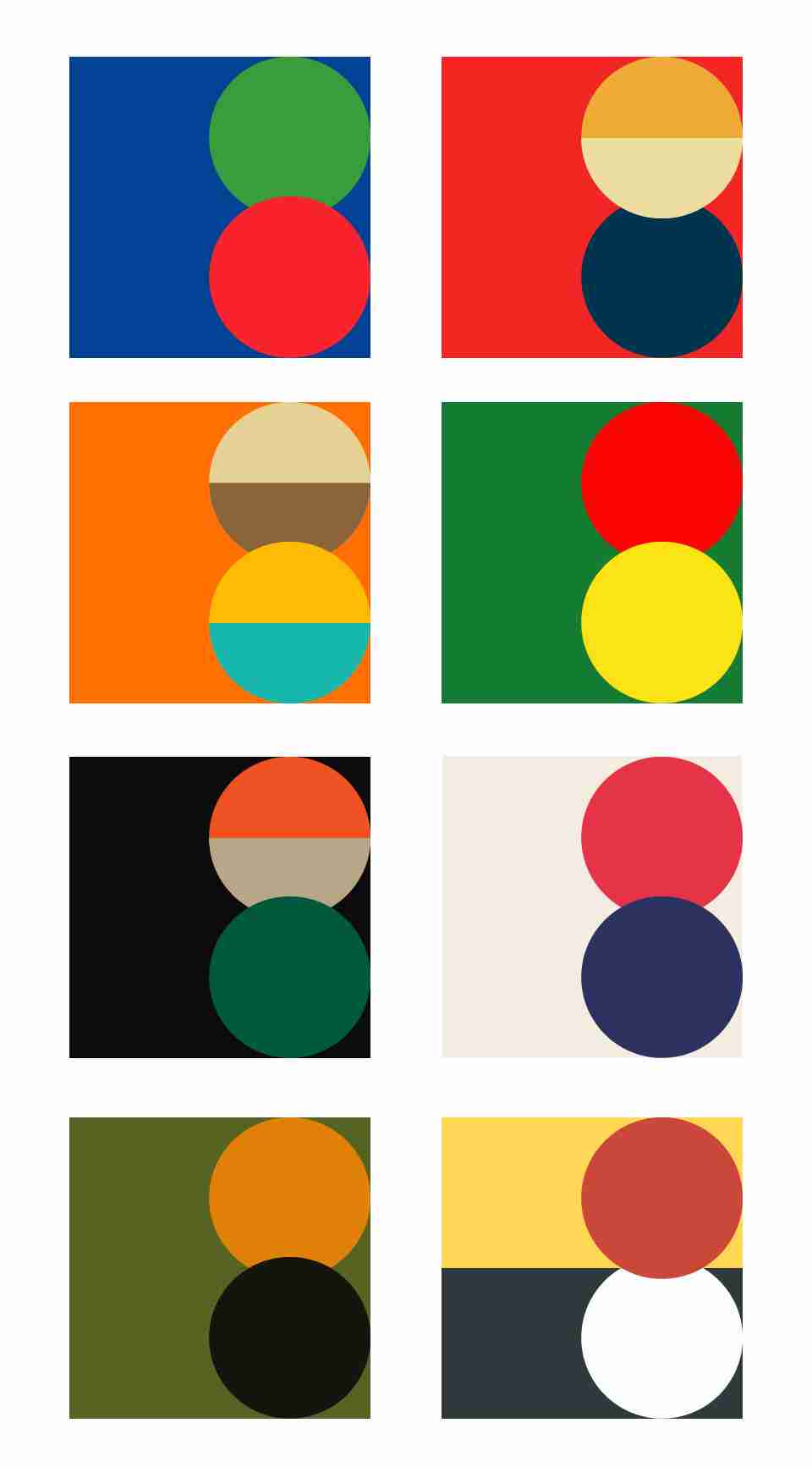
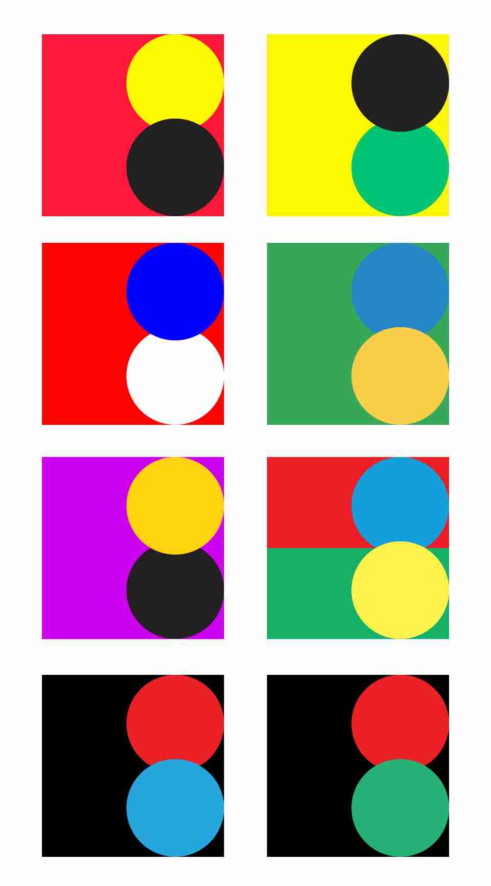
In addition to the above moods, here are some timeless color combinations that work well across various design contexts. These include red-yellow-black, red-white-blue, and yellow-green-black. Such combinations are often seen in graphic design, especially in posters.
Notes:
- In the color schemes listed above, rectangular blocks represent background colors, while circular blocks denote colors for images or text elements.
- For combinations that exclude black, white, or gray, feel free to incorporate these neutrals as needed, such as for text elements.
Countless colors can convey these moods. By observing and practicing in daily work, you can build a personal library of color palettes.